

 There is a lot of talk as to what makes a good web design. But let’s just start by simply saying that designing an effective and usable website implies hard work and a lot of research. It is also worth mentioning that web design is still gaining pace and that the trends in this medium change as frequently as technology does.
An effective website design is the online means through which users achieve set goals. Pages that are user-focused, ensure effortless experience, interaction and usability are tools that are sought by search engines. Thus, website design is a vital component of SEO strategy.
These are the pillars for good web design:
- Attractive layout
- Translates brand’s identity
- Has content that the audience looks for
- Uses call-to-action buttons in the right places
- Is intuitive and user-friendly
- Makes use of Search Engine Optimization (SEO)
As a business that strives to make its online presence memorable there are some crucial facts that contribute to your business’s marketing power among the online audience. But, with the multitude of web design elements out there, it is difficult to decide which ones will help to make the difference.
Below are 8 imperative elements that a good web design should include.
Intuitive structure
One of the core principles that apply to a good web design is that the page must be highly intuitive. This means that it must have a simple to understand structure so that users’ navigation experience across the website is effortless. Questions like “now what?”, “what should I click on to get to the X piece of information?” have no room in the site’s intuitive structure definition. The user must flow from one category to another in a self-explanatory and obvious way. Simple navigation is the key to high usability of the website.
Visual hierarchy
The next principle to follow for an effective website design is the visual hierarchy. This feature implies placing content on the page in a certain sequence. The designer identifies what piece of content/topic/image is the most important and organizes the page in such a way that the focus falls on it first and then moves to the other content in a hierarchical manner. This feature is useful in emphasizing and directing user’s attention to the priority information.
There are several principles that the visual hierarchy implements, in its turn, in web design:
- Size – as the name says it, the most important elements of a website design are those of bigger size. It follows the concept that bigger is more noticeable and users respond better to items that require less effort to click on.
- Content – place it in such a way that visitors see first the content that is most important and then move to the less important part of it.
- Color – many notorious websites make use of color to emphasize the visual hierarchy and the importance of a certain element against another.
Use of white space
To make your website content easily digestible, don’t be afraid to use white space. White space is the area left unmarked by text and visual content, such as images and videos. This principle has an important function as it facilitates perception of the information and improves website performance. White space helps to divide the page into parts and contributes to easy processing of information.
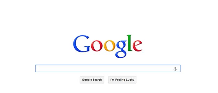
Google homepage make good use of white space. It displays a lot of white space, thus the user can focus on the most important action: search.
Even though it is called ‘white space’ it doesn’t necessarily have to be left white. Designers can fill it with any color, as long it is free of any design elements and doesn’t interfere with overall readability of the page. The use of white space accounts for clear and simple layout.
Content
The content on the website is not only the text that you write to fill in pages with, or the articles on the blog. Website content is a wider concept and includes all text and visual elements that are placed on the site: images, graphics and infographics, video and audio files. The content must be addressed to your target audience and must be provided in a manner that facilitates understanding. Therefore, it is crucial to know your readers first. Keep in mind their demographics and write copy that associates with their views and what they look for. Use the language style that your readers are likely to be using and show them that you are part of their gang.
The content provided on your page is a marketing tool as well. It must be engaging enough to keep your users interested and craving for more and must aim at what you want to achieve.
Besides that, the copy on the web page must be well written, always fresh and search engine optimized. Keeping in mind what your audience wants to read about will help you write copy that is searched for and will bring you leads.
Typography
It is no secret that the typefaces a website employs account for the readability of the text. Understanding the different principles of typography contributes to creating an appealing design that translates the site’s vision and mood.
However, as with other elements, too much is the wrong approach to a beautiful web design. There are several rules in typography that will make the general appearance of the page look nice and well-structured:
Rule No #1 Limited typeface choices. This is to ensure consistency in the design and to make the content look beautiful. The best thing is to identify 2-3 font styles that are representative of the website’s goals and purposes and stick with them.
Rule No #2 Size. First, the font size must ensure easy readability. Browser default setting for font size is of 16 pixels. Second, use larger font size to emphasize on more important parts of the content, such as a title or subtitle.
Rule No #3 Alignment. The alignment is the feature used to arrange text on a page. There are four types of alignment: left, right, centered and justified. Use alignment to guide readers to the most important pieces of content and information and help them flow effortlessly from one paragraph to another.
Color
Another significant principle that dictates how good a website can be is the use of colors. Colors convey the meaning of the brand and the general mood of the website. Due to the colors’ psychological meaning and various interpretations across the globe, you might want to make your homework before employing a certain color palette that associates with your target audience.
Read How Colors Can Impact Website Success to get detailed insights into proper color use when designing web pages.
For example, for a memorial site, DesArt Lab web design agency uses pastel colors that translate for the calm and peace that the acceptance of losing a beloved person gives.
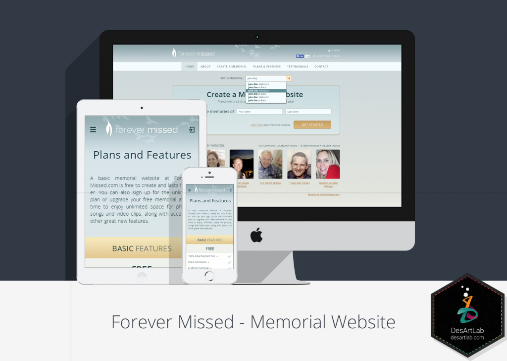
A memorial site designed by DesArt Lab uses pastel colors that convey a message of acceptance of lost ones.
Color is also important in typography as well. Using different font colors and background that are hardly to read is a turnoff for the site’s users. Identify the color contrast that works best together and doesn’t affect the readability.
Here are some good examples of color contrasts used in website design typography:
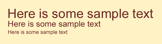
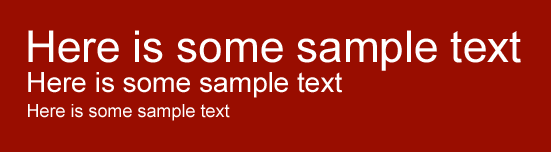
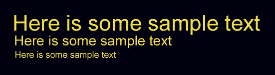
As seen from the above color combinations the text keeps its readability.
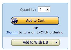
Color can be used to direct users where you want them to go. Use red and orange for primary links and green and blue for secondary links. Also, use color to make a call-to-action shout to the user and invite him to perform that action. A good example is Amazon’s “Add to cart” yellow colored button and the use of a fade color for other less significant ones.
Read this: How Colors can Impact Website Success to get more insight into the way colors can be successfully used in website design.
Usability
Website design is not only about beautiful pictures, engaging content and appropriate colors. The task every page has is to ensure usability. This means that the website designer must anticipate the user’s actions and design a layout that will make performance of these actions easy. If you design an online marketplace, consider placing ‘start shopping’ action button in a visible section of the page, encouraging users to perform this action freely.
Identifying the tasks that the users are about to perform on your site can help you design in a way that these tasks are easily achievable.
Consistency
Consistency is probably a principle that must be in the blood of every web designer. It is a default feature that applies to a website that wants to make a statement and increase the brand’s popularity. It means that the typography, color palette, content tone and visuals style must be preserved across the entire website. Any deviation might mean that you don’t mind the page’s image and can be confusing. Consistency stands for professionalism.
Conclusion
Knowing how to use these principles is every web designer’s job in creating an effective website design. Take the time to analyze every step and learn how to apply them together to get the desired result. There is, of course, the unpredictability factor that every user brings, even though the design is perfect. Keep in mind that design is both science and art. So make your artistic skills shine.