

 Time is everything. There is no next time, it’s now or never, which is why the best design is the one that helps you save time.
In our age of ever-evolving technologies, the demand for fluid and attention-grabbing designs is higher than ever. But why business owners and experienced marketologists are so hell-bent on introducing certain elements of design? The reason is quite simple. In compliance with Amazon research even 1 second delay in loading costs around $1.6 billion in sales. According to Google reports if the page loads even 0,4 of a second slower Google looses approximately 8 million searches!
Knowing that it’s impossible not to ask how this problem can be rectified. Some companies, whose conversion rate heavily depends on the loading time (such as search platforms), estimate special budget, undergo various optimizations and buy servers in the countries you’ve probably never heard about. However, as it turns out – even that is not enough, because we all have various time perception and the fastest loading page doesn’t guarantee that your end users will perceive it as one. The only thing that really matters is how people perceive the waiting time and what emotions they experience.
In compliance with the recently conducted studies, if visitors of the website successfully accomplish what they needed to do, they think that the loading time was fast. But why? It cannot be explained scientifically and replies fully on person’s feelings. When we are happy – we perceive time running faster and are much more patient. Absolutely the same notion regarding the emotional reaction to the website design must taken into account while designing the interface.
In this article we’ll take a look at certain aspects and strategies of design that can modify users’ time perception and contribute to the creation of fluid experiences.
1.Users must be occupied with something
 It’s not a secret that when we’re occupied with any activity time passes much faster. Actually it’s one of the oldest strategies of them all. You have probably noticed magazines and catalogues in the waiting rooms. The same principle goes for web: previously users were presented with a sad option of looking at the white blank page, while the new page was loading. This was the moment of emptiness and hesitation.
Nowadays, this problem was resolved by a very simple, but neat trick. Currently users see the page of the website they were previously browsing, while the new page is loading.
Due to the fact that users were looking through the previous page, they were under the impression that the next page was loading faster. Note, that in this instance namely the psychology was at work, not technology. The more engaging elements are offered to the users, the faster they perceive the loading time to be. Technology is not the answer to everything, sometime we need to take into account the human factor.
- Actions feedback must be instant
Nowadays, pages have a multitude of buttons to like something, send message and lots of other options. All these buttons are connected with servers and delay the response time. It is essential to deal with this issue if you want to keep customers on your page long enough to convert them. According to the results of the research, conducted in 1968, the response time is perceived in 3 categories:
- 100 milliseconds – everything seems to be loading instantly if the response time is less than 100 milliseconds
- 1 second – user perceives the delay calmly as he still believes that he’s in control of the loading speed
- 10 seconds – it’s a point in time, when users start to get truly upset, which creates negative experience.
You can smoothen users’ perception by creating small animated icons that are shown during the time when the server communication takes place. Interactive and optimistic UI can do wonders for user’s patience and overall satisfaction with the website.
- Dynamic Interfaces can significantly improve User Experience
![User Experience]()

If your goal is to improve user’s emotional state, while he waits for the page to load, you need to make the waiting time as exiting as possible to shift his attention to something interesting. And what can do a better job than motion? Dynamic interfaces have become a must in the modern day website design. However, one must always keep in mind that the length of the animation plays a great role in the users’ perception. If you make it too long, users will feel tired of the necessity to watch your animation every single time.
- Modal Spinners must be used very carefully
 Experience makes an impact on how a person perceives anything similar happening to him. For example if a person once experienced the annoying wait in the queue, he will most likely feel the same irritation, while standing in the line next time. Exactly the same happens with spinners and the way the majority of websites use them. Nevertheless, it doesn’t have to be like that. Let’s examine the following situations:
1) User sends a message and sees modal spinner on full screen, that reflects that the message is currently being sent.
2) User sends a message and sees a tiny spinner in the corner of the message box, which disappears when the message is delivered.
It’s pretty much obvious which approach is better. The 2nd one communicates fluidity, which is a much more pleasant experience than staring at the full screen spinner. Nevertheless, designers usually prefer the 1st approach simply because it is easier to build.
- Longer waiting time can seem shorter if presented correctly
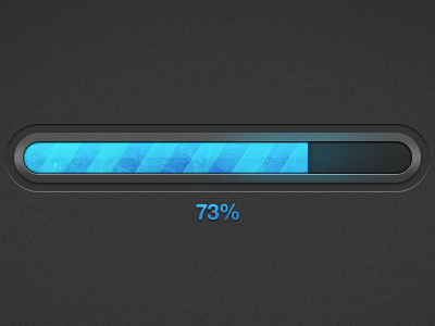 One of the most common representations of waiting time is a progress bar. As it turns out it can also be shown and perceived in different way. So what’s the wrong way to present a progress bar? The answer to that lies in the correct representation of the loading process. For example, if the progress bar is showing that the page is 99% loaded for half an hour, there must be no surprise that the user will get frustrated because he could have used this time to make himself a sandwich or do something useful.
However, building a progress bar that truthfully represents the loading time is an incredibly complicated task. The goal is to make people believe that the bar is moving at the acceptable speed, but the design of the progress bar itself can significantly modify general perception. In compliance with a study, conducted by Chris Harrison, progress bar that blinks is perceived as a faster one in comparison to a static one. The illusory perception improved even more, when moving ribbings were added to the progress bar. Overall, just these slight modifications have increased the level of users’ satisfaction with the speed by 11%. If you also make the bar load faster in the beginning and in the end – your goal of reducing user’s irritation caused by waiting can be easily achieved.
- Content must be loaded starting with the baseline
We’ve already established that the waiting time is inevitable no matter how hard you try to reduce it. Nevertheless, you can make the experience much more pleasant. Users need to see at least something in order to have an impression that time flows quickly and doesn’t just stand still. Therefore, the content on your page must start loading with baseline images, which load from top to bottom. They provide seamless transition from blank to fully loaded page, as user sees the progress and his attention is focused on it.