

 Responsive website design becomes increasingly popular, practically a must for companies that wish to extend their reach across numerous platforms and attract visitors with various devices. Knowing the new tendencies is extremely important for web designers and design studios in general. Nevertheless, it’s worth to read the research papers on the new trends to see if they actually pay off and work as they were intended to, attracting masses. Sometimes, people think that they want something, while actually they lose interest to this item/action very quickly. You need to design your website in a way that will appeal to customers and attract them whether they like it or not.
For example, people just love information, especially interesting one. We are all information junkies, it gives us some sort of rush, like tasty food or sex. However, we’re unable to process big volumes of information, despite our desire to have it. This is the reason why text on the websites is presented in short blocks with clear and large headlines. Thus, you will pay your full and undivided attention at least to one of the presented articles and won’t divert it to some eye-candy: shiny and engaging.
So, in order to be on top of your competition you need to know for sure what tendencies are and will be in next year. What innovations and web design trends are we to expect in 2016? Let’s take a look at the most popular ones.
- Responsive website design
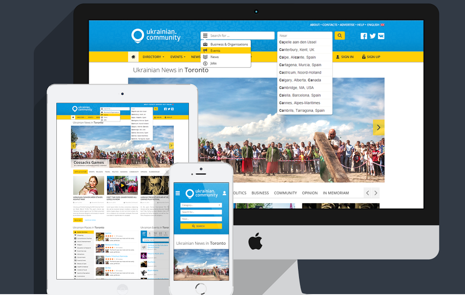 Since we have already mentioned it earlier, we’ll talk about it’s recent tremendous popularity in the light of the widespread usage of mobile internet. So why it has become a must in the world of the current web design. The answer is simply – it’s an affordable way to considerably increase reachability of your business across various platforms. It allows your website to adapt to any device it is open with. Soccer mom can browse it from her mobile phone, student can open it, using tablet, businessman can browse it from his desktop PC or notebook. All of them will see your website in the most pleasant and user-friendly format.
However, almost all the good things have some small drawback or two, Achilles’ heel if you will and responsive web design is no exception. In case of responsive website design this heel is the performance. No one denies the connection of responsive web design with minimalism and its amazing ability to work on various devices. However, it has to work fast and this is the main problem. It’s worth to mention that high speed is important not only for the UX – Google specifically introduced Mobile Friendly to make users’ experience more pleasant. Nowadays, responsive web design is gradually becoming a good practice instead of stylish trend.
Correspondingly, designers are now trying to find various ways to resolve performance issues and here are several solutions:
- Conduct performance testing for each website
- Use RESS, instead of mere responsive web design
- Don’t use JavaScript and CSS image loading
- Use percentage-defined responsive images
- Use conditional loading for JavaScript
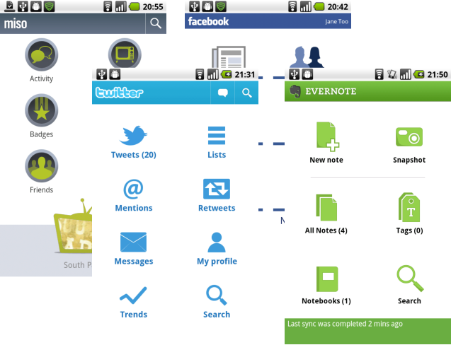
- UI Patterns that are here to stay
 Currently we are witnessing the rise of WordPress websites and they all look kind of similar. Nevertheless, we shouldn’t automatically assume that if our website looks somewhat like another one – it’s going nowhere. With the flow of time people changed their perception of the web. Innovations come and go, be it because they eventually become annoying (like that fad for shiny, blinking cursors with traces of shiny dust or stars, hearts and what not) or simply because they are unnecessary or hard to use and people don’t like to do more work than it’s absolutely necessary.
However, every design has basic features that will always be there, because they are a given. For example, no matter how you design login page – it will always remain login page. You simply don’t have any motivation to create something new. Besides, users are accustomed to basic patters and if the result of their action on your website leads to unpredictable outcome – it may cause displease and we all know how hard it is to keep a customer on a page.
Thus, here is a short list of patterns that will not be removed or changed in the nearest future and maybe even never:
- Login page: Despite the fact that the form seems to be disappointingly boring and conventional, it won’t go anywhere because it’s necessary practically on every website.
- Registration page: Just like login page, registration page is a necessary evil. You can furnish this page with a couple of buttons, leading to social media. For example, registering with your Facebook or Twitter.
- HD Photos: One of the best ways to capture users’ attention are qualitative HD photos. Luckily, with the modern breakthrough in bandwidth and data compression, size of these photos doesn’t influence the performance.
- Long scroll: this one’s quite tricky, because users’ opinions regarding it are divided. Some of them (predominantly mobile users) prefer long scrolls over multiple pages, but desktop users consider scrolling down a bit tiresome. However, the latter one isn’t a problem if you divide your text in clear sections.
- Hamburger menu: This pattern is easily recognizable by users, which is why it will remain in the new designs of 2016. People love innovations, but they also cherish something familiar.
- Vivid and unusual animations

People like with their eyes, which is why engaging and bright animations are a very popular UI pattern and will remain as such for a long time. Gifs or other short animations make every story way more interesting than it would have been without any visual aids. It helps us to perceive the texts interactively, allowing us to experience story, almost like a movie, filling in the blanks between animations in our mind. Website designers use two types of animations: small scale and large scale ones.
Among small scale animations are spinners, blinking progress bars and hover tools. These animations require little-to none user input and are perceived as an integral part of the design.
Large scale animations are usually big and colorful means of engaging users in order to get them do certain action on your website. Since both are vital for your website – none of them will vanish and both will still be used in 2016.
- Micro interactions

Micro interactions are tiny actions that we accomplish, paying absolutely no attention. For example, micro interaction will be liking your friend’s photo on Facebook or turning off your alarm. In both of these cases you’re engaging user interface for just a tiny bit of time. Now imagine how many of these unassuming tiny actions you accomplish, while using an app or website. Micro interactions are an essential part of any application and are necessary for provision of feedback, so that your users can see the result of their actions.
In order to provide positive UX you need to ensure that these micro interactions are almost invisible and work as seamlessly as they possibly can. Don’t try to provide overwhelming feedback from simple pushing of a button. Lack of feedback or going overboard with it is never good. It removes the feeling of human interaction and you hardly need that, especially taking into account that currently the main goal of web environment is to feel as human as possible.
- Material Design

Material Design is a style language, introduced by Google in 2014. Currently, it is considered a practice, rather than a website design trend. The considerable advantage of Material Design is in its smoothness: it allows no sharp corners or sudden shifts between tabs. Everything is accomplish naturally and even more beautifully than in flat design, loved by many designers and website owners alike. He man goal of the material design is to make the experience as pleasant for a user as it can possibly be. It’s all about transparency, fluidity and comfort. Material Design is highly esthetic. It’s also easy to code and is able to integrate an enormous multitude of features. With Material Design Lite that is created specifically for websites, it’s safe to say that just like responsive website design, Material Design is here to stay and for a long period of time.
Here’s an infographic that summarizes the web design trends for 2016 kindly offered by Coastal Creative.
![Popular web design trends for 2016 [infographic].](http://www.desartlab.com/wp-content/uploads/2015/10/wed-design-trends-desartlab.jpg)