

SaaS, or Software as a Service, is a web-based tool that helps users use a software right from their browser, without the need to install it on their computers. The software is thus hosted in a central location and the user can access it easily. The user simply pays a monthly or yearly fee, depending on the package he selects.
When creating a SaaS website design you have a primary goal set in your mind – to get as many visitors and then convert these visitors into customers. There are different ways to do this:
- newsletter subscription;
- live-chat interaction;
- webinar subscription;
- call-to-action button.
These tools help create a database of emails which you can use to contact prospects.
However, what are the elements that ensure that your SaaS website design appeals to your prospects?
6 strategic elements that will make your SaaS website design convert more visitors.
#1. Make your proposition clear
This is to answer to the potential customers’ question: what makes you different from the others and do you do better than your competition?
This one-sentence proposition must be catchy, to sell your product and to make visitors believe that they have found their partner.
Here are is a good example of value proposition that grabs the attention of the website visitors:
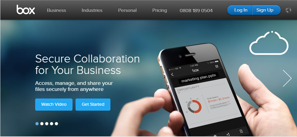
Box has come with a smart proposition, with ‘SECURE’ as a very powerful word that makes you stop your quest and rely on this tool.
#2. User-friendly homepage
Users are hard to please. And when it comes to web design it is even harder. Various design elements, such as banners, pop-ups and animation have their place. But if the website gets too cluttered, it is easy for the user to get distracted from the website’s primary message.
Keeping the homepage design simple and to the point, with an attention-grabbing call-to-action button will make the difference.
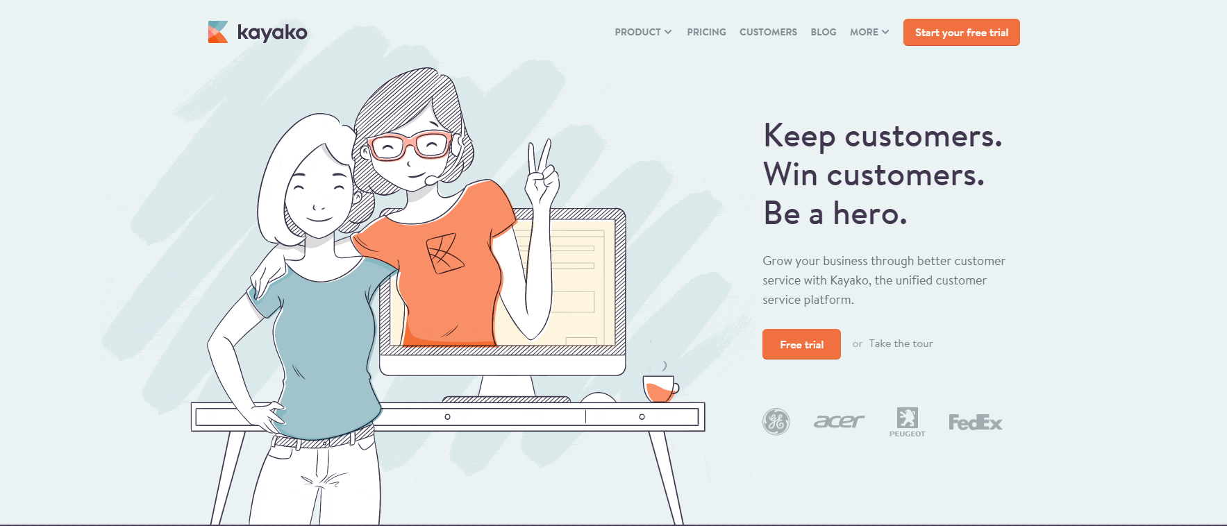
Kayako does it well, with a simple background picture, a powerful proposition message and 2 call-to-action buttons (at the top and the bottom of the homepage).
Read also: How to Create the Perfect One-Page Website Design
#3. Call-to-action button
Call-to-action button is what makes people perform a certain action. Call-to-action button design is a different story. There are various things to consider before you design and incorporate this type of button on the SaaS homepage:
- shape;
- color;
- words.
Nevertheless, this small, yet very important element of the website, is the one that triggers subscribers and enlarges your customer email database or increases sales.
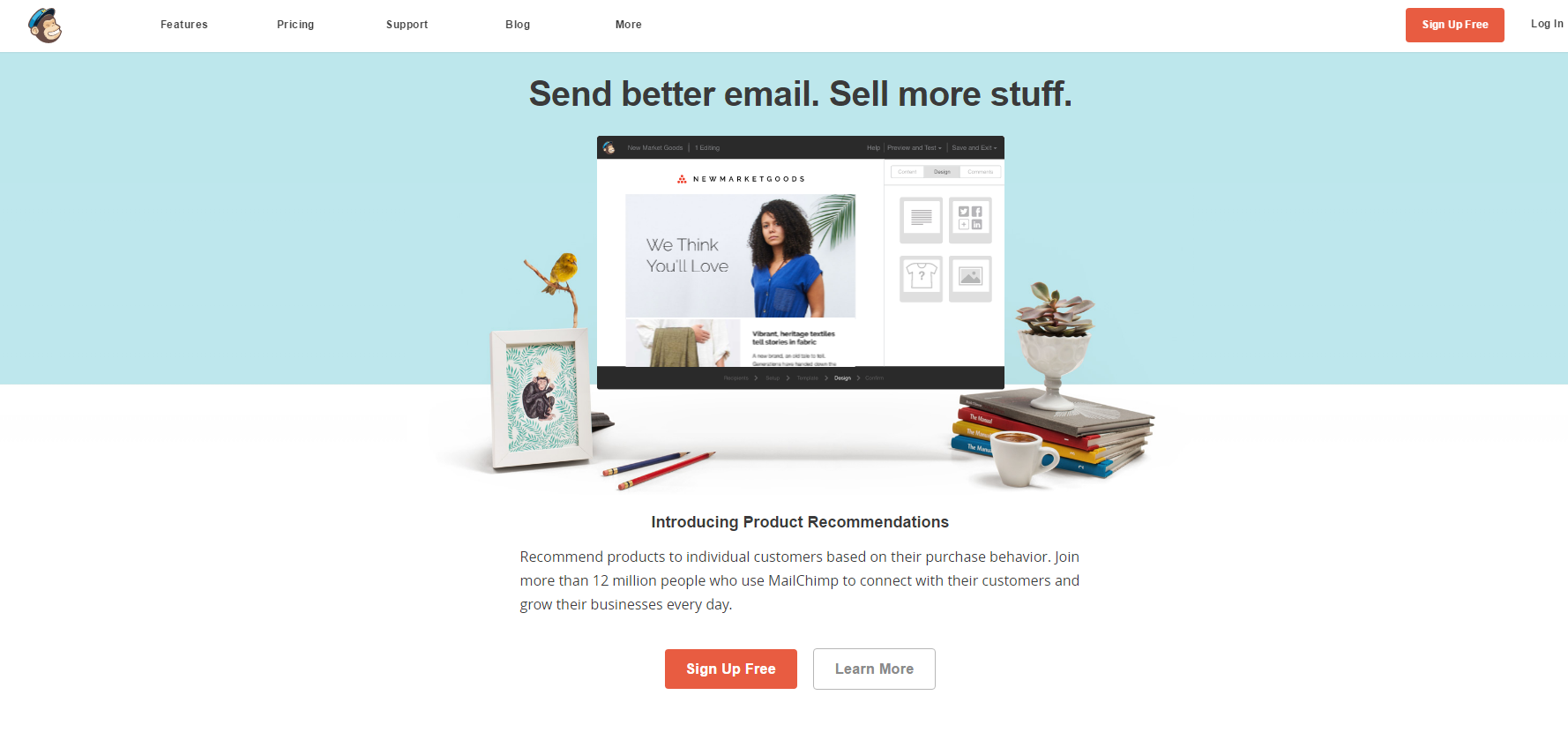
Mailchimp uses a deep orangey color for its call-to-action button and the ‘Free’ word which is a win.
#4. Demo
Often, people who get to your product’s web page will want to test it right away. This is where the demo version of the product will come in handy.
Signing up for a free trial is a good way for conversion. However, as the time is precious and people don’t have the luxury to waste it on free trials that can turn out useless for their purpose, the demo version is a go.
Read also: 6 Expert Startup Website Design Tips
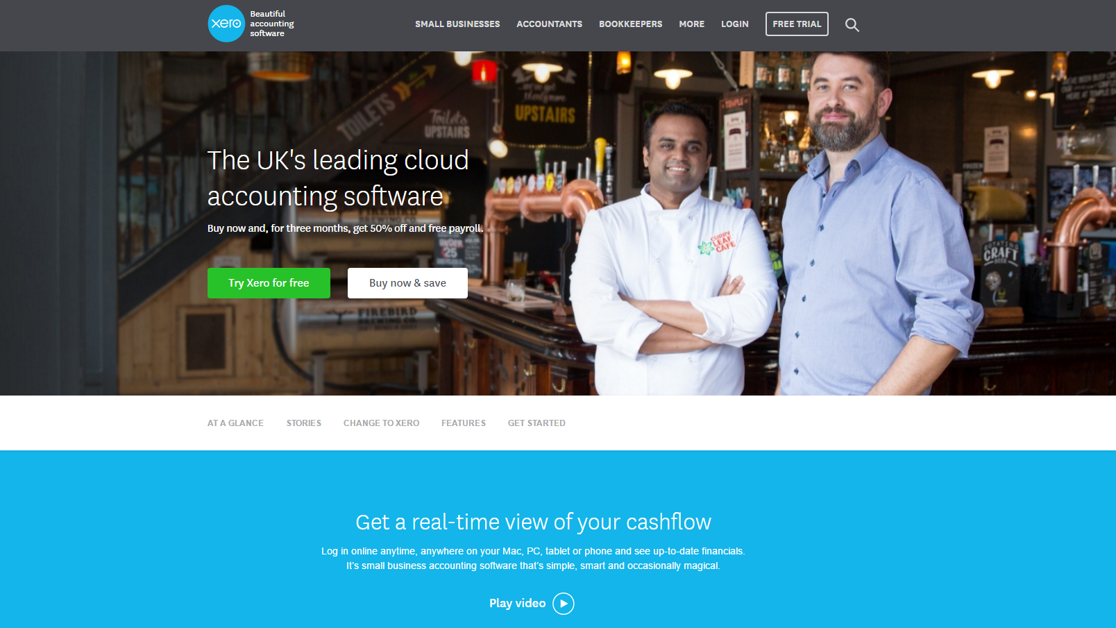
#5. Free trial option
For those who want to test the app for a longer period, there are free trials. Free trials don’t require credit card data and are from 2 to 4 weeks. This timeframe allows the potential users to decide whether the soft is what they have been searching for their business.
Free trial option can be made visible by designing a call-to-action button. The more visible its placement, the more trial users you will get.
Here is a good example of where to place the ‘Free Trial’ button on the page:
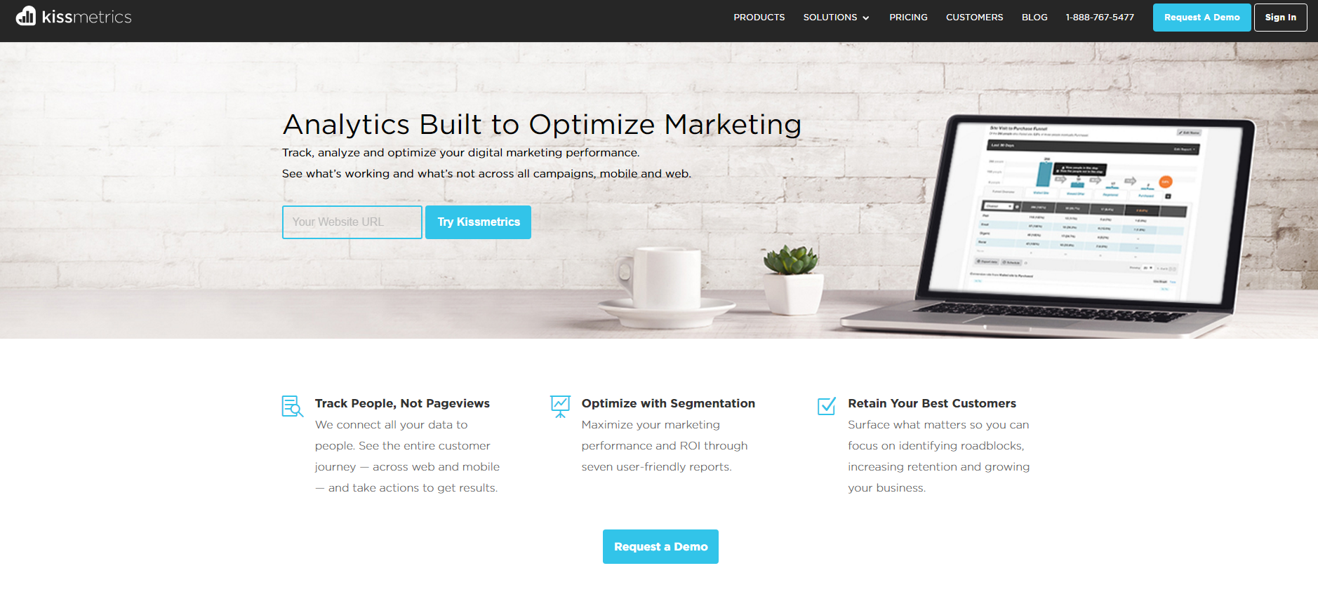
#6. Contact information
And last, but not the least, make contact information easily findable on the SaaS website homepage. People don’t want to lose time searching for your contact information and will leave the site if they can’t find it easily.
Placing your company’s telephone number in a visible place will make potential customers know that you are there to listen to them.
Kissmetrics place their telephone number in the header of the homepage, where it can be found fast by the users.
Conclusion
A strategic SaaS website design should include these 6 elements if you want your web-based software to garner as many customers as possible.